Curtain mistakes that make custom curtains look too dark, too heavy, or just off


Custom curtains should make a room feel softer, more finished, and more intentional. But sometimes, once the panels are installed, the room suddenly feels darker, heavier, or smaller than expected.
That does not always mean you chose the wrong curtains. In many cases, the issue comes from how several details work together: fabric color, lining, fullness, rod placement, hardware scale, and the room's natural light.
If your custom curtains look too dark, too heavy, or simply “off,” do not rush to replace them with plain white panels. This guide will help you identify what is actually causing the problem, what you can fix without reordering, and when a new custom setup may be the better solution.
Why custom curtains can look “off” after installation
Most people blame color first because color is the easiest thing to notice. But the real issue is often visual weight.
A curtain can look too dark because of the fabric itself. It can also look too dark because the room has limited daylight, the lining is dense, the rod is mounted too low, or the panels are too full for the wall.
That is why custom curtains can look beautiful when the details are planned together, and disappointing when one or two specifications do not fit the room. Custom sizing makes every proportion more intentional. It also makes mismatches easier to notice.
Most curtain problems come from one of these three areas:
- The color and undertone do not work with the room's natural light.
- The fabric weight, lining, and fullness create too much visual density.
- The length, rod position, and hardware scale throw off the room's proportions.
Before judging the fabric by the swatch alone, look at the full setup.

If you are still choosing your curtain specifications, start with the TheHues curtain measurement guide and keep your full wall view in mind while you compare fabrics, lengths, and headers. Good measurements can prevent many expensive curtain mistakes before they happen.
Curtain mistakes that make curtains look too dark
Dark curtains are not automatically a mistake. In the right room, they can look rich, cozy, and polished. The problem starts when the room already has limited daylight, cool wall tones, or heavy furniture, and the curtains add one more dark or dense layer.
The wall color and natural light may be the real issue
Natural light changes how curtain color looks more than many shoppers expect. A soft taupe or flax fabric may feel warm in a bright west-facing room, but the same fabric can look muddy in a north-facing room with cool gray walls.
Many curtain color mistakes are really light-direction mistakes. If you are wondering should curtains be lighter or darker than walls, do not decide from one swatch photo. Check the room in morning light, afternoon light, and evening lamplight.
Sherwin-Williams explains that Light Reflectance Value, or LRV, runs from 0 to 100. Lower values reflect less light, while higher values reflect more. That matters because curtains are not seen in isolation. They are seen beside the wall color, flooring, furniture, ceiling height, and the amount of daylight the room receives throughout the day.
If your curtains look darker than expected, check these details first:
- the room orientation
- the wall undertone
- the time of day you are judging the fabric
- whether the swatch was tested flat instead of hanging vertically
- whether the nearby furniture, rug, or flooring is also visually heavy
Before changing the entire setup, compare your fabric in different light conditions. A color that looks wrong at noon may look balanced at night, or the opposite may be true.
You can also pair your swatch review with the TheHues visualization tool or order curtain swatches before committing to a full set of panels.

Lining and opacity can make the fabric look heavier
This is one of the most common curtain mistakes in bedrooms, media rooms, nurseries, and home offices. The face fabric may be the right color, but the liner may be adding more visual weight than the room needs.
The U.S. Department of Energy notes that a large share of sunlight that falls on standard double-pane windows can enter as heat during cooling seasons. That is a practical reason to choose blackout or thermal lining when glare, sleep quality, or heat control matters.
But not every room needs the most opaque curtain configuration. A dense liner can make the whole panel look stiffer, deeper, and more substantial, especially when the face fabric is already dark or textured.

This effect becomes more noticeable on wide windows, where a large amount of fabric remains visible even when the curtains are open.
If the room only needs moderate privacy or soft light filtering, ask whether the real issue is too much opacity. A lighter liner, a softer fabric, or a layered sheer-and-curtain setup may give you the function you need without making the room feel closed in. The TheHues curtain liner guide can help you compare liner options before you reorder.
Do not automatically switch to white curtains
Many people jump from “these curtains are too dark” to “I need white curtains.” That is not always the right fix.
Plain white curtains can look crisp and fresh in some rooms, but they can also feel stark, flat, or unfinished, especially beside cool wall colors or high-contrast furniture.
The usual dark vs light curtains debate is too simple. A better question is whether the curtain value, undertone, texture, and opacity fit your specific room.
Instead of moving straight to bright white, test a lighter value in the same color family. For example:
- move from espresso to mushroom or warm taupe
- move from dark olive to soft sage
- move from charcoal to warm gray
- move from deep beige to natural linen
The goal is to reduce visual weight while keeping enough depth for the room to feel finished.
Curtain mistakes that make curtains look too heavy
When people say their curtains look heavy, they are usually describing one of two problems. Either the fabric is physically dense for the room, or the curtain looks bulky because there is too much material in too little wall space.
Too much fullness is easy to overlook
Fullness is what makes curtains look soft, generous, and finished instead of flat. But too much fullness can make even a beautiful fabric feel overbuilt.
This often happens on smaller walls, low ceilings, narrow windows, and rooms where bulky furniture already sits close to the window.
The problem may not be the curtain color at all. It may be the combination of dense fabric, dense lining, and abundant fullness on a modest wall.
Ask yourself:
- Do the open panels take up too much of the wall?
- Do the curtains look bulky even when tied back?
- Does the room feel narrower after the curtains were installed?
- Does the fabric stack block too much of the window glass?
If the answer is yes, the issue may be fullness, stack-back, or hardware placement rather than color alone.
Fabric and rod placement can create visual density quickly
A heavy fabric looks even heavier when the rod is mounted too low or too narrow.
Low rod placement compresses the wall above the window and can make the ceiling feel lower. Narrow rod placement prevents the curtains from clearing the glass, so more fabric stays gathered near the window opening.
That is why the same curtains can look elegant in one room and overwhelming in another. Proportion changes everything.
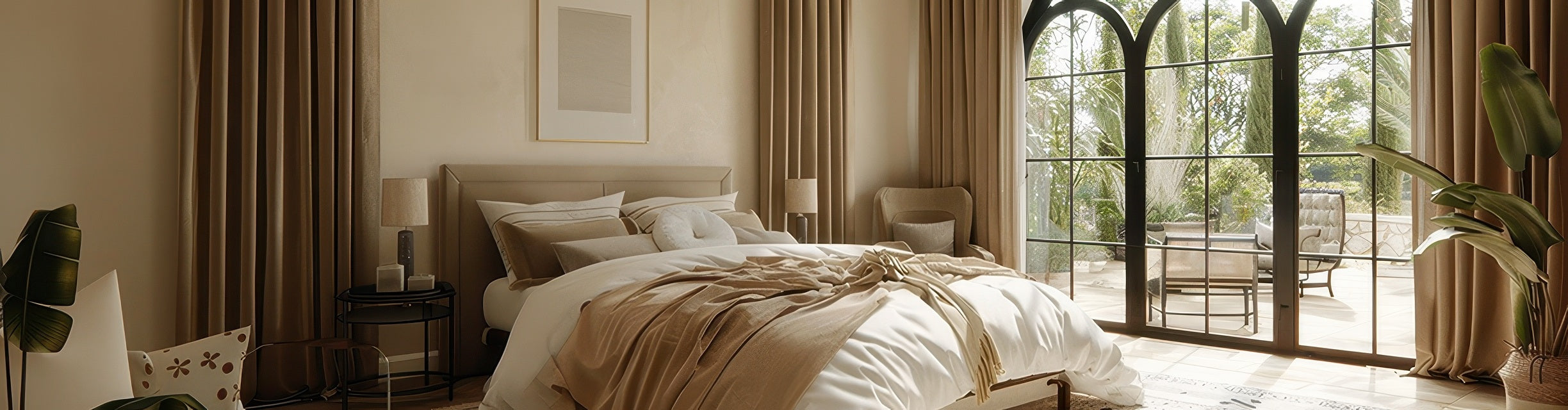
When space allows, many designers prefer hanging the rod higher and wider than the window frame. More height creates a longer vertical line, while more width gives the panels room to stack neatly at the sides instead of bunching against the glass.
Layering can solve heaviness without losing function
Sometimes the answer is not lighter curtains. It is better balance.
Layered sheer curtains behind a moderate drape can soften the room more effectively than one very dense panel doing all the work alone. This approach works especially well when you want daytime privacy, soft filtered light, and stronger light control at night.

Layering can also make a room feel less formal. Instead of relying on one heavy curtain panel, the window treatment feels more flexible and lived-in.
If your current panels feel visually dense, try these adjustments before reordering:
- open the panels farther so less fabric covers the glass
- use tiebacks or holdbacks to soften the stack at the sides
- test whether the room needs a sheer layer instead of a heavier face fabric
- review your heading style with the TheHues header guide
You may find that the fabric is not too heavy. It may simply be hanging in the heaviest-looking way possible.
Curtain mistakes that make custom curtains feel off even when the color is right
This is the most frustrating type of curtain problem. The color works. The fabric quality is good. The length seems correct. But the room still does not feel settled.
In that case, look beyond fabric and color. The issue is often proportion, hardware, panel layout, or heading style.
Rods that are too low or too narrow make the window feel compressed
This is one of the most common curtain mistakes because it feels safe to mount the rod close to the window frame. In reality, cautious rod placement can make custom curtains look less custom.
A rod mounted only slightly above the trim can make the window look shorter. A rod that barely extends past the frame can make the panels look crowded and block more light than necessary.
When the rod is raised and extended wider, the exact same curtains can look more tailored. The color does not change. The proportion does.
Panel width and stack-back matter more than most people think
Custom curtains should look intentional both closed and open. If they look good closed but awkward open, check the stack-back. If they look thin or stretched when closed, check the panel width.
Common proportion issues include:
- panels that are too narrow to create a relaxed drape
- panels that are too wide for the available wall space
- not enough room for curtains to clear the glass when open
- one oversized panel where two balanced panels would work better
Panel layout is often the hidden reason curtains feel clumsy rather than polished, especially for large windows, patio doors, and wide living room walls.
Header style and hardware should feel like they belong together
Some curtains look off because the top treatment and hardware are telling different design stories.
A sleek modern rod with thick traditional pleats can feel mismatched. Soft linen on overly decorative hardware can feel visually confused. Even a beautiful fabric can lose its effect when the heading style, rod finish, and room style do not support each other.
If the room feels subtly wrong, compare these details:
- the rod finish against nearby metal finishes
- the header style against the room's level of formality
- the curtain break against the flooring
- the fabric texture against the furniture scale

Fix the easy curtain mistakes before you reorder
Do not reorder immediately. Troubleshoot first.
A surprising number of curtain mistakes can be improved with hardware adjustments, styling changes, or a better understanding of how the room light affects the fabric.
Work through this list in order:
- Recheck the room in changing light. Look at the curtains in the morning, afternoon, and evening.
- Check rod height and width. These two dimensions can completely change the look of the window.
- Pull the panels fully open and study the stack-back. If the wall feels crowded, the issue may be fullness or width.
- Test tiebacks or holdbacks. A softer stack can make the room feel lighter without changing the fabric.
- Compare the liner to the room's actual needs. Blackout, thermal, and dense linings add function, but they also add visual presence.
- Review the fabric beside flooring and upholstery. The curtain may be fine. The surrounding finishes may be making it look heavier.
If you are still unsure, use the visualization tool to test a lighter-value fabric, a different fullness strategy, or another header style before spending money on a replacement.
When reordering custom curtains is the smarter fix
Sometimes the right answer is not another adjustment. It is a better curtain specification.
This is especially true when the problem is built into the curtain itself, such as the wrong opacity, the wrong fullness ratio, or a fabric category that does not match the room's needs.
Reorder when the opacity or lining is fundamentally wrong
If the room only needed privacy and soft light control, but the curtains were made with a dense blackout configuration, you may keep fighting the same heavy look no matter how well you style them.
The reverse can also happen. If a bedroom truly needs blackout performance and you keep trying to make a light, unlined panel do that job, the room may never function the way you need it to.
In both cases, reordering with the right liner is more practical than continuing to compromise.
Reorder when the width and fullness ratio missed the room
This is a strong reason to start over because the visual math will not change on its own.
Panels that are too narrow will continue to look stretched. Panels that are too full for the wall will usually keep looking bulky. Custom curtains work best when width, length, fullness, and stack-back are planned as one system instead of separate choices.
Reorder when the fabric category is wrong for the space
Some rooms need airy movement. Some rooms need structure. Some need glare control, insulation, acoustic softness, or privacy first.
If the fabric category does not match the room's main job, styling adjustments may only go so far. A breezy linen-look curtain, a structured drape, a blackout panel, and a layered sheer setup all solve different problems.
If you are not sure which direction to take, send your room photo, wall width, and current concerns to the TheHues free design service. A second opinion can help you avoid repeating the same mistake with a new order.
Quick room-by-room curtain mistake check
Different rooms can make the same curtain mistake look different. Use this table as a quick diagnosis tool before changing anything.
| Room | The curtain looks wrong when... | Most likely cause | Best first fix |
|---|---|---|---|
| Small north-facing living room | the wall feels darker and the window looks narrower | low light, dense fabric, and too much fullness | test a lighter-value fabric or reduce visual bulk at the sides |
| Bedroom with blackout needs | the curtains work at night but feel heavy during the day | blackout liner, dark face fabric, or low rod placement | raise and widen the rod, then reassess before changing fabric |
| Dining room | the setup feels too formal or visually stiff | low rod placement, heavy stack-back, or mismatched hardware | adjust placement and simplify the top treatment |
| Family room | the curtains look expensive but awkward | wrong panel count or poor stack-back planning | recheck width and whether one panel should become two |
| Home office | glare is controlled but the room feels flat or closed in | opacity is stronger than the room needs | test a lighter liner or a layered sheer setup |
One helpful question is this: does the room look better when the curtains are open, closed, or neither?
If open looks good but closed looks wrong, check width, fullness, and fabric value. If closed looks good but open looks wrong, check stack-back and hardware placement. If neither looks right, go back to color undertone, liner choice, and rod position.
FAQ about curtains that look too dark or too heavy
Why do my curtains look darker than the swatch?
Swatches are often viewed flat, close up, and under different lighting than the final room. Once the fabric hangs vertically in a larger amount, the wall color, daylight direction, liner, and nearby furniture can make it look deeper than expected.
Should curtains be lighter or darker than the walls?
Either can work. Lighter curtains usually feel softer and airier, while darker curtains can add contrast and depth. The better choice depends on the room's natural light, wall undertone, furniture scale, and how much visual weight you want around the window.
Can blackout curtains make a room feel smaller?
They can if the fabric is very dark, the liner is dense, the panels are too full, or the rod is mounted too low and narrow. A higher, wider rod and better stack-back can make blackout curtains feel more balanced.
How can I make heavy curtains look lighter without replacing them?
Start by opening the panels farther, adding holdbacks, raising or widening the rod if possible, and reducing how much fabric blocks the glass. You can also balance dense panels with lighter bedding, rugs, wall color, or sheer layers.
When should I reorder instead of adjusting the setup?
Reordering makes sense when the lining, width, fullness, or fabric category is fundamentally wrong for the room. If the curtains are too narrow, too bulky, or too opaque for your needs, styling changes may not fully solve the issue.
Final takeaway
The best custom curtains do not call attention to every decision behind them. They simply make the room feel more balanced, comfortable, and finished.
If your curtains look too dark, too heavy, or just off, the problem is usually easier to solve once you separate color from opacity, opacity from fabric weight, and fabric weight from proportion.
Keep these takeaways in mind:
- most curtain mistakes are proportion mistakes before they are style mistakes
- dark curtains are not the problem unless the room is already low-light or visually heavy
- heavy-looking curtains often come from fullness, stack-back, lining, and low rod placement
- custom curtains work best when fabric, liner, width, header style, and hardware are chosen together
If you are ready to correct your setup, start with the measurement guide, compare options in the custom curtains collection, and use the free design service if the room still feels hard to read.
The goal is not just to make the curtains look better. It is to make the whole room feel intentional again.


