What Color Curtains Go With Your Walls? The Complete Pairing Guide


Choosing curtain color is easier when you start with the wall, not the product page. Your wall color sets the backdrop for the whole room, so the curtain should either soften it, balance it, or create intentional contrast.
If a curtain swatch looks wrong next to your paint, the issue is usually not the color alone. It may be the undertone, the amount of daylight in the room, the fabric texture, or how much visual weight the curtain adds once it is hanging full size.
This guide explains what color curtains go with common wall colors, how to decide whether curtains should be lighter or darker than your walls, and what mistakes to avoid before ordering custom curtains.
Quick guide: curtain colors for popular wall colors
Use this table as a starting point, then test swatches in your own room. Paint colors can shift throughout the day, especially in north-facing rooms, rooms with strong afternoon sun, and spaces with warm artificial lighting.
| Wall color | Curtain colors to consider | Best for |
|---|---|---|
| Light gray | White, ivory, soft taupe, navy, dusty blue | Clean, flexible rooms that need softness or contrast |
| Dark gray or charcoal | Ivory, warm white, silver gray, blush, emerald, mustard | Moody rooms that still need lightness and texture |
| Bright white | Natural linen, warm gray, navy, charcoal, black, soft pastels | Modern rooms that need structure or warmth |
| Off-white or cream | Sage, oatmeal, warm taupe, terracotta, dusty blue | Warm neutral rooms that need depth without harsh contrast |
| Beige | Olive, rust, navy, warm white, charcoal, dusty rose | Earthy rooms that need a clearer color direction |
| Greige | Cream, cool gray, taupe, forest green, soft blue | Balanced spaces that can lean warm or cool |
| Light blue | White, cream, sandy beige, natural linen, soft coral | Coastal, calm, or airy rooms |
| Navy or dark blue | Ivory, warm white, gold, blush, light gray | Bold rooms that need contrast and brightness |
| Sage or soft green | Cream, linen, taupe, dusty blue, blush | Relaxed, nature-inspired rooms |
| Forest green | Ivory, warm gray, mustard, charcoal, natural linen | Deep, cozy rooms that need balance |
| Yellow or warm gold | White, cream, gray, navy, muted plum | Bright rooms that need a calmer anchor |
| Terracotta or red clay | Cream, olive, charcoal, warm taupe, soft gold | Warm rooms where the wall is already the statement |
Three ways to match curtains to wall color
Most good curtain color decisions fall into one of three approaches: blend, contrast, or tone-on-tone. Choosing the approach first makes the actual fabric choice much easier.
1. Blend for a calm, seamless look
Choose a curtain color close to the wall color if you want the room to feel quiet and cohesive. This works well in bedrooms, small rooms, nurseries, and spaces where you do not want the window treatment to become the main focal point.
For example, light gray walls can pair well with soft silver, pale taupe, or cool ivory curtains. Cream walls often work better with natural linen, oatmeal, or warm white instead of bright white.
2. Contrast to make the window stand out
Choose a curtain color that is noticeably lighter or darker than the wall if you want the window to feel more designed. Contrast works especially well in living rooms, dining rooms, and bedrooms that need more structure.
White walls with navy curtains, gray walls with ivory panels, or sage walls with warm cream curtains can all create a clear, finished look without feeling too busy.
3. Use tone-on-tone for subtle depth
Tone-on-tone means staying in the same color family but choosing a curtain one or two shades lighter or darker than the wall. This is one of the easiest ways to make a room feel layered without adding a strong accent color.
Light gray walls with deeper gray curtains, soft blue walls with dusty blue panels, or beige walls with warm taupe curtains can all feel polished when the undertones are right.

Should curtains be lighter or darker than walls?
Curtains can be lighter or darker than your walls. The better choice depends on room size, daylight, privacy needs, and the feeling you want the room to have.
Choose lighter curtains when the room needs airiness
Lighter curtains can make a room feel brighter and more open. They are usually a strong choice for small bedrooms, low-light living rooms, apartments, and rooms with medium or dark wall colors.
White, ivory, cream, oatmeal, and soft gray curtains can brighten walls without looking stark, especially when the fabric has a visible weave or gentle texture.
Choose darker curtains when the room needs structure
Darker curtains can make a room feel more grounded and finished. They are often useful in bedrooms, media rooms, dining rooms, and white-walled spaces that feel too plain.
Darker colors can also support light control. If you are choosing blackout curtains for a bedroom, colors like navy, charcoal, deep green, and warm brown can feel both practical and designed.

Undertones matter more than the color name
Many curtain color mistakes happen because the wall and fabric have different undertones. A curtain can be called beige, white, or gray and still lean warm, cool, pink, yellow, blue, or green.
The safest rule is to pair warm with warm and cool with cool. A cool gray wall usually works better with cool white, silver, blue-gray, or charcoal curtains. A warm beige wall usually works better with ivory, taupe, rust, olive, or warm linen.
Before ordering, hold your fabric sample directly against the wall and check it in daylight and evening light. If you are comparing several fabrics, order from the curtain swatches collection first instead of judging from a screen alone.

Best curtain colors for gray walls
Gray walls are flexible, but they are also undertone-sensitive. The same gray paint can look blue, green, purple, or warm beige depending on the light and surrounding finishes.
Light gray walls
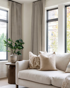
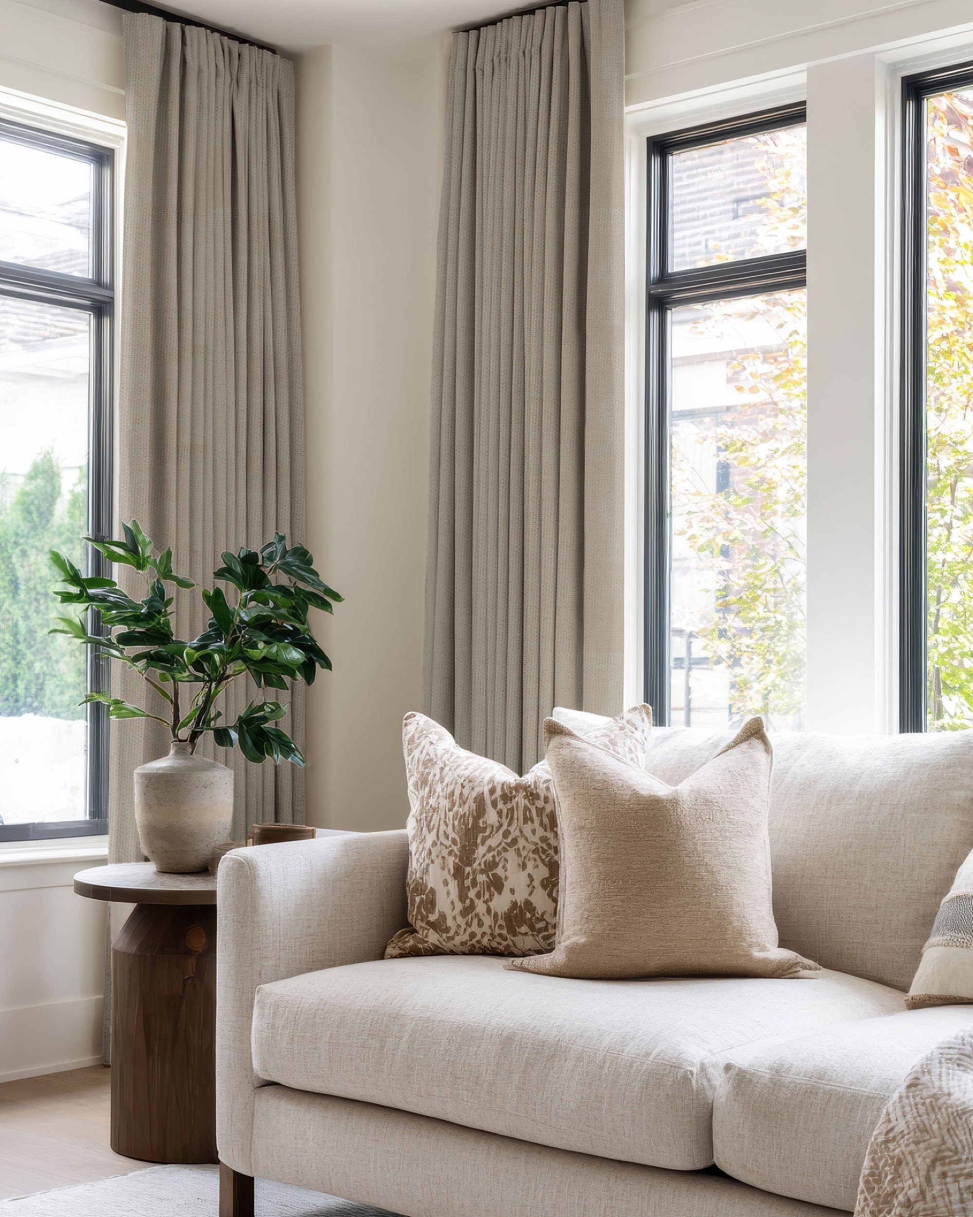
Light gray walls work with many curtain colors. Use white or ivory for a clean look, soft taupe for warmth, navy for contrast, or dusty blue for a cooler tone-on-tone effect.
If the room feels cold, avoid curtains that are too icy or flat. A linen texture, warm white, or soft beige can make the space feel more comfortable.
Dark gray or charcoal walls
Dark gray walls usually need contrast or texture. Ivory, cream, soft silver, blush, and muted gold can keep the room from feeling too closed in.
Deep colors can also work, but use them carefully. If the walls are charcoal and the curtains are also dark, the room needs good lighting, lighter furniture, or enough fabric texture to avoid a flat look.

Best curtain colors for white and cream walls
White walls give you the most flexibility, but they also make curtain texture and fabric quality more noticeable.
Bright white walls
Bright white walls can handle contrast. Navy, charcoal, black, warm gray, and deep green curtains can help the room feel more finished. For a softer look, use natural linen, oatmeal, pale blue, or blush.
If the room gets strong sunlight, consider layering sheer curtains with a heavier outer panel. Sheers can soften daylight during the day, while the outer layer adds privacy and depth at night.
Off-white and cream walls
Cream walls usually work better with warm curtain tones than with stark white. Try ivory, natural linen, oatmeal, sage, terracotta, or soft taupe.
The key is to avoid a near-match that looks accidental. If the curtain is close to the wall color, choose a fabric with visible texture so the window still has dimension.
Best curtain colors for beige and greige walls
Beige and greige walls are common because they are easy to live with. The main risk is choosing curtains so close to the wall color that the whole room looks flat.
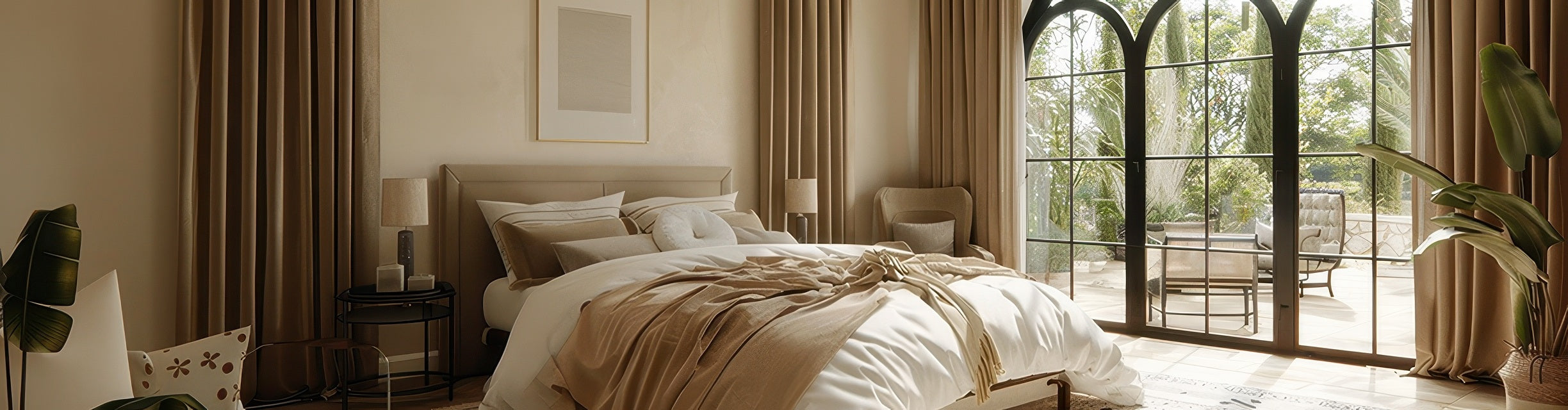
Warm beige walls
Warm beige pairs well with rust, olive, navy, warm white, charcoal, and dusty rose. These colors give beige walls a clearer direction and keep the room from feeling washed out.
If you prefer a neutral look, choose curtains at least one shade lighter or darker than the wall. Natural linen, warm taupe, and ivory are usually safer than trying to match the exact beige.
Greige walls
Greige sits between gray and beige, so the curtain can push the room warmer or cooler. Cream, taupe, and natural linen make greige feel warmer. Cool gray, dusty blue, or forest green can make it feel more modern and balanced.
Best curtain colors for blue and green walls
Blue and green walls already create a strong mood. The right curtain color should support that mood instead of competing with it.
Blue walls
Light blue walls pair well with white, cream, sandy beige, natural linen, soft coral, and pale gray. Navy or dark blue walls usually need more contrast, so ivory, warm white, light gray, blush, and muted gold are strong options.
For bedrooms with blue walls, soft neutrals are often easier to live with than high-contrast accent colors. They keep the room calm while still making the window feel finished.
Green walls
Sage green walls look natural with cream, linen, taupe, dusty blue, and blush. Forest green walls often need more lift, so try ivory, warm gray, mustard, charcoal, or natural linen.
If you are unsure, start with a neutral curtain and use smaller decor pieces for stronger accent colors. Curtains take up a large visual area, so a small color mismatch becomes more noticeable once the panels are installed.
Best curtain colors for warm and bold walls
Yellow, terracotta, red clay, and other warm wall colors need a calmer curtain choice. These wall colors already bring energy, so the curtain should usually balance the room rather than compete with it.
Yellow or warm gold walls
White, cream, gray, navy, and muted plum can all work with yellow walls. If the yellow is bright, keep the curtain simple and solid. Patterned curtains may make the room feel too busy.
Terracotta, red clay, or brown walls
Cream, ivory, olive, charcoal, warm taupe, and soft gold can support earthy wall colors without overpowering them. For a softer look, choose a linen texture instead of a shiny or flat fabric.
Room-by-room curtain color tips
Living room
Living rooms usually need a balance of style, daylight, and privacy. If the wall color is neutral, curtains can add contrast. If the wall color is already bold, curtains should usually calm the space down.

Bedroom
Bedrooms usually work best with calmer curtain colors. Soft gray, ivory, dusty blue, blush, warm taupe, and deeper blackout colors can all work depending on the wall color and sleep needs.
If you need more darkness, prioritize the right lining and coverage, not just the color. The curtain liner guide can help you compare light-filtering, privacy, blackout, and thermal options.
Kitchen and breakfast nook
Kitchens often need privacy without blocking all the daylight. If your kitchen walls are white, cream, blue, or sage, cafe curtains in light neutrals or soft colors can keep the room bright while covering the lower part of the window.
Home office
For a home office, choose curtain colors that reduce glare without making the room feel dark. Warm gray, sage, dusty blue, taupe, and soft linen tones are good starting points. If the room gets strong sun, review lining or layered options before choosing the final fabric.
Common curtain color mistakes to avoid
- Ignoring undertones. Warm and cool neutrals can clash even when the colors seem similar.
- Matching the wall too exactly. A close match can look flat unless the fabric has strong texture.
- Choosing from online photos only. Screens can shift color. Test swatches against your actual wall.
- Going too dark in a low-light room. Deep curtains can look beautiful, but they need enough light and contrast around them.
- Using pattern in an already busy room. If your wall color, rug, or furniture is strong, a solid curtain is usually safer.
- Forgetting scale. A color that looks subtle on a small swatch may feel much stronger across full-length panels.
How to test curtain colors before ordering
Before placing a custom order, compare your favorite swatches directly against the wall. Check them in morning light, afternoon light, and evening lamplight. Also hold them near the sofa, flooring, bedding, or cabinets, because curtains rarely sit visually against the wall alone.
When you narrow the color down, use the TheHues visualization tool to preview the overall look, then confirm sizing with the curtain measurement guide. Color matters, but the wrong width or length can still make a good fabric look unfinished.
FAQ: curtain colors and wall colors
Should curtains match the wall color exactly?
Usually, no. Exact matches can make a room feel flat. A better approach is to choose a curtain one or two shades lighter or darker, or to use a similar color with a different texture.
What color curtains make a room look bigger?
Light curtains such as white, ivory, cream, oatmeal, and soft gray can make a room feel more open. Hanging curtains higher and wider than the window frame can also make the window look larger.
Should curtains match the walls or the furniture?
Either can work. A reliable approach is to connect curtains to a secondary color in the room, such as a sofa, rug, headboard, or wood tone, while making sure the curtain still works with the wall undertone.
Can I use patterned curtains with colored walls?
Yes, but use restraint. Patterned curtains usually work best with neutral or simple walls. If the wall color is bold, a solid curtain in a coordinating tone is often easier to live with.
Are dark curtains a bad idea for small rooms?
Not always. Dark curtains can look cozy and polished in a small room, but they usually work better when the room has good lighting, light bedding or furniture, and enough wall space around the window. In a very low-light room, a medium tone may be easier than a very deep color.
Final takeaway
The best curtain color is not chosen in isolation. Start with your wall undertone, decide whether you want to blend or contrast, then test the fabric in the room where it will actually hang.
If you are still unsure, order swatches, compare them throughout the day, and use TheHues' free design service for a room mock-up before placing your order. A little testing upfront can help your curtains feel intentional from the first day they are installed.