How to Choose the Right Color for Your Linen Curtains


Don't Just Guess: How to Pick Curtain Colors That Actually Fit Your Room
Most people treat curtains as an afterthought. They spend weeks picking a sofa, then buy the first drapes that match the rug. This is a mistake. Curtains take up a massive amount of visual real estate. If you get the color wrong, the whole room feels "off," even if you can't put your finger on why.
You don't need to be an interior designer to get this right, but you do need to understand how faux linen interacts with your specific environment.
1. Respect the Undertones (Or Regret Them Later)
Color is never static. That "perfect beige" you saw online has an undertone—usually pink, yellow, or green. If your walls are a cool gray and you hang a beige curtain with yellow undertones, they will clash. The curtain will look dirty, and the walls will look blue.
The Rule of Thumb: Match the temperature. If your wall paint is cool (blues, cool grays, bright whites), stick to cool-toned curtains (pure white, charcoal, cool greige). If your room is warm (creams, warm woods), lean into warm neutrals (oatmeal, ivory, rust).

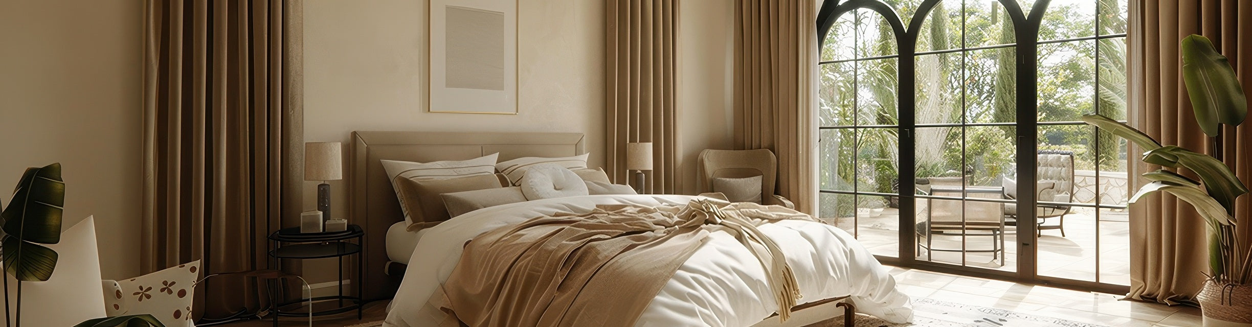
2. The "Visual Weight" of the Wall
Should curtains match the wall? It depends on the goal. If you match the curtain color exactly to the wall, the window disappears, making the room feel larger and more modern. This is great for small spaces.
However, most designers prefer the "Two-Shade Shift." Go two shades darker or two shades lighter than your wall color. This creates depth and frames the window without creating a jarring contrast. Faux linen is excellent for this because the texture adds interest even when the colors are similar.

3. Lighting Changes Everything
The direction your window faces dictates how the color reads. Do not skip this step.
- North-Facing Rooms: The light is consistent but cool and bluish. It tends to flatten colors. Avoid cool grays here; they will feel depressing. Warm up the space with oatmeal, cream, or textured earth tones.
- South-Facing Rooms: You get intense, warm, golden light. This makes colors pop but can also turn creams into yellows. Darker colors (navy, charcoal, olive) look rich and stunning in this light.
4. The Truth About Neutrals and Texture
There is a misconception that you need bold colors to make a statement. Not true. Faux linen is prized for its weave and drape.
Fact Check: Lighter colors (white, off-white, flax) actually show off the linen texture better than dark colors. The shadows caught in the weave are more visible on light fabric. If you want that breezy, high-end organic look, go lighter. If you want drama and silhouette, go darker.

5. Stop Guessing: The "Live With It" Test
Screens lie. Monitor calibration varies. The only way to be 100% sure is to see the fabric in your room.
Don't just hold a swatch up against the wall and decide in five seconds. Tape the fabric sample to the window or wall. Look at it in the morning, at noon, and at night with your artificial lighting on. If you still love it after 24 hours, that’s your winner.


