Light vs. Dark Curtains: How to Choose the Right Color for Your Room (Without Regrets)


In this article 8 sections
- 1. The Core Dilemma: Why Choosing Curtain Color Feels So High-Stakes
- 2. Light Curtains: When to Use Them (and When They Look Washed Out)
- 3. Dark Curtains: When They Create High-End Drama (and When They Ruin a Room)
- 4. The 3 Mistakes People Make When Matching Walls to Curtains
- 5. Paralyzed by 3 Similar Swatches? Why Your Screen Is Lying to Your Eyes
- 6. How to Test Colors Risk-Free Before You Buy
- Frequently Asked Questions
- Finding Your Balance
Choosing window treatments often feels like a guessing game. You stand in an empty room holding fabric swatches, wondering if a dark panel will make the space look like a cave or if a pale linen will wash out against your walls.
1. The Core Dilemma: Why Choosing Curtain Color Feels So High-Stakes
Selecting window fabric is the final visual anchor of a room. Paint, flooring, and furniture are already locked in place, leaving the curtains to pull the entire space together.
Picking the wrong tone throws off the visual balance. A fabric sample that looked promising online can easily turn harsh under standard domestic lighting.
Evaluating room dimensions, natural light volume, and daily maintenance habits clears up the confusion. Instead of guessing based on digital screens, looking at structural realities points straight to the right color family.
2. Light Curtains: When to Use Them (and When They Look Washed Out)
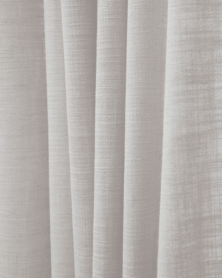
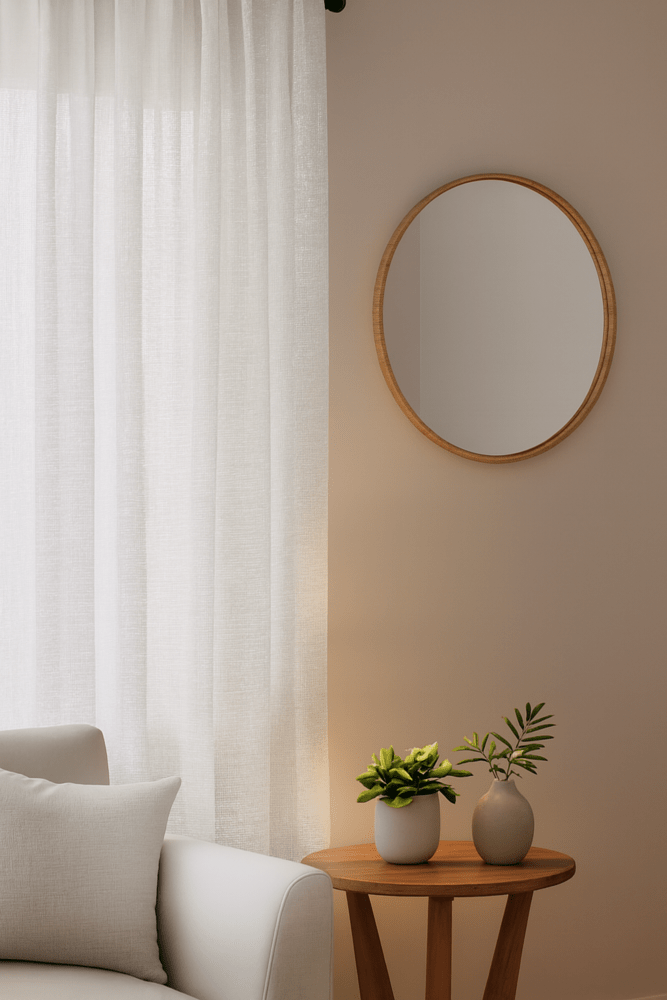
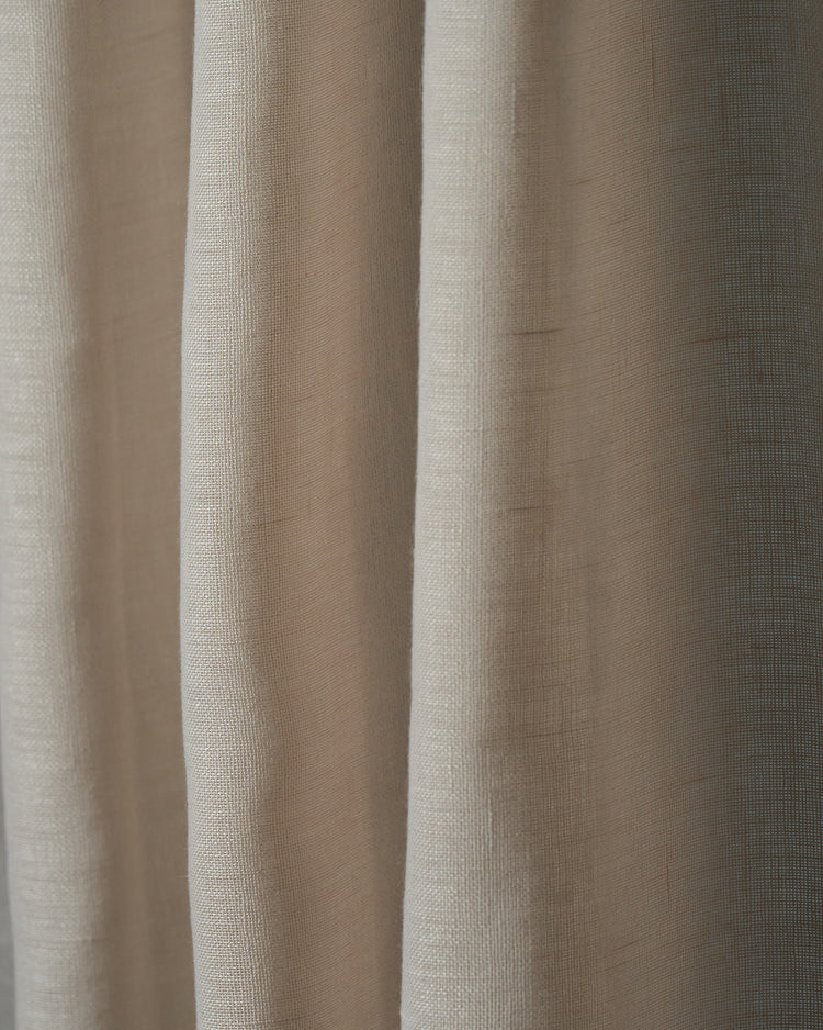
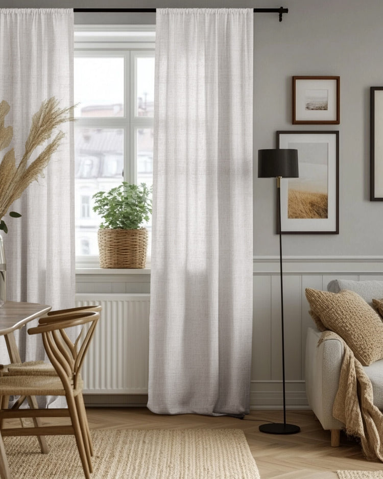
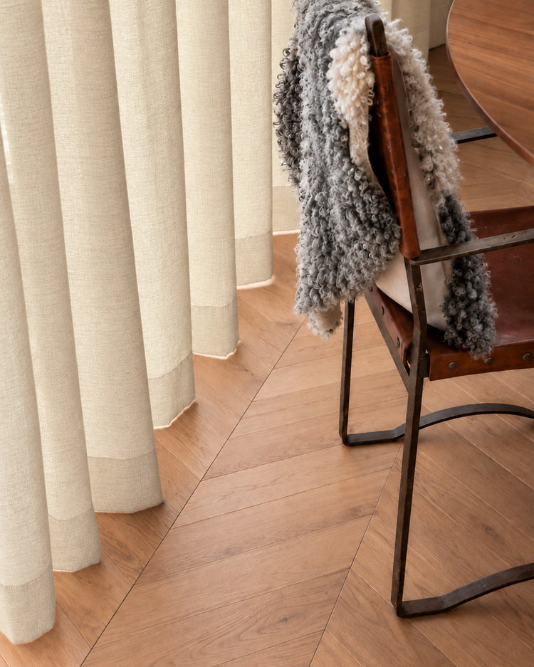
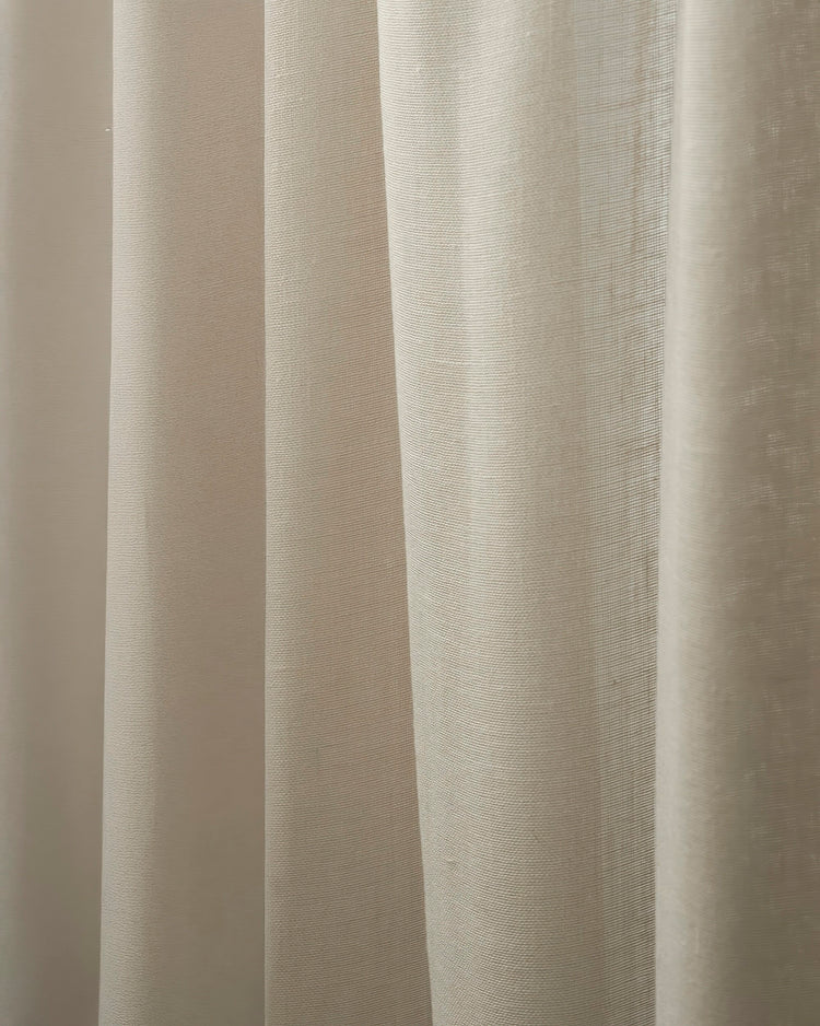
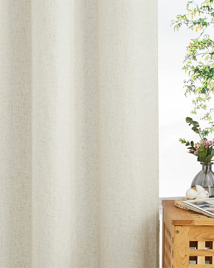
Light window treatments introduce an open, airy quality to interiors. Soft creams, muted ivories, and pale oatmeals reflect incoming sunlight, bouncing illumination across walls and making compact rooms feel larger.
| Light Curtain Metric | Ideal Applications | Potential Drawdowns |
|---|---|---|
| Room Size & Layout | Small bedrooms, low-ceiling living rooms, north-facing spaces | Shows dust, lint, and pet hair more readily than darker fabrics |
| Aesthetic Context | Rooms styled around white trim and neutral architectural details | Can look washed out or sterile against bright, unshaded white walls |
Properties with low ceilings or narrow floor plans benefit immensely from light curtains because they prevent window frames from looking blocked off.
However, pale panels carry practical limitations. In rooms flooded with intense midday sun, unlined light fabrics fail to block glare effectively. Furthermore, white and beige fabrics show dust and pet hair faster than darker textiles, requiring more frequent washing in high-traffic family areas.

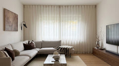
For a serene, restful primary bedroom, a classic ivory white tone creates an instant sanctuary. This cozy setup by @ohana_and_mom pairs textured ivory drapes with warm lighting, proving that lighter shades can still maintain a deeply comforting, private atmosphere when layered correctly.
3. Dark Curtains: When They Create High-End Drama (and When They Ruin a Room)
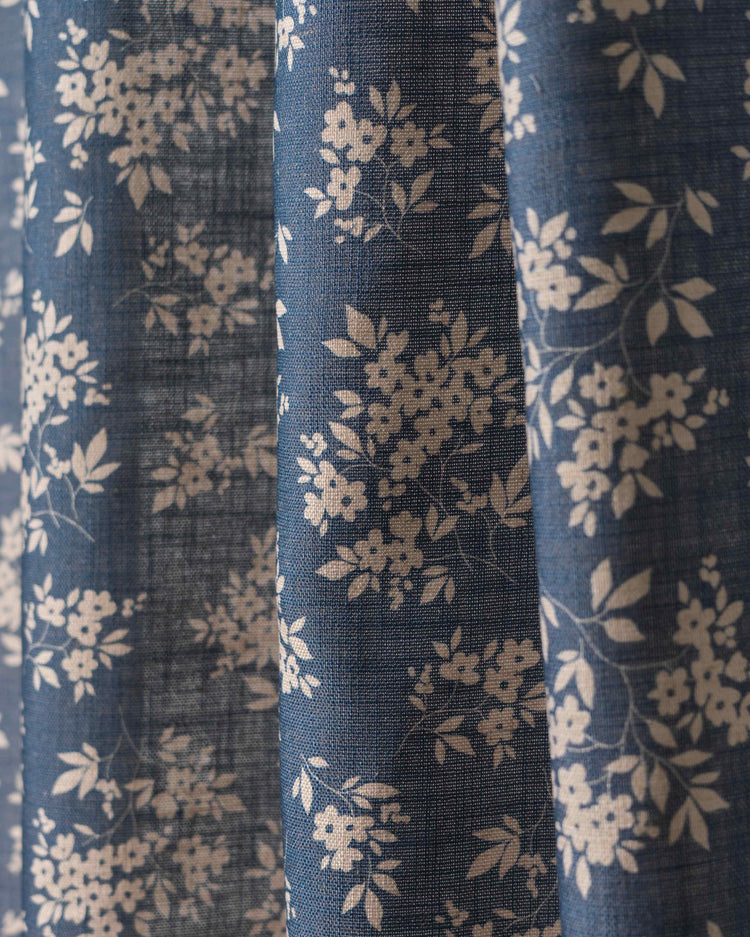
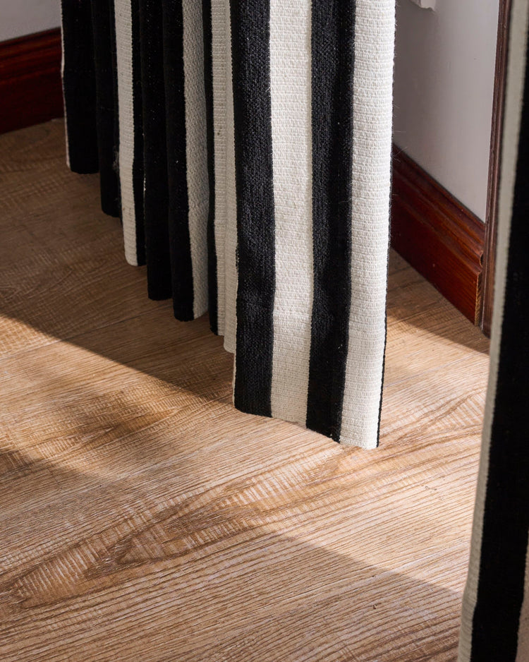
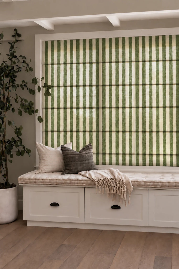
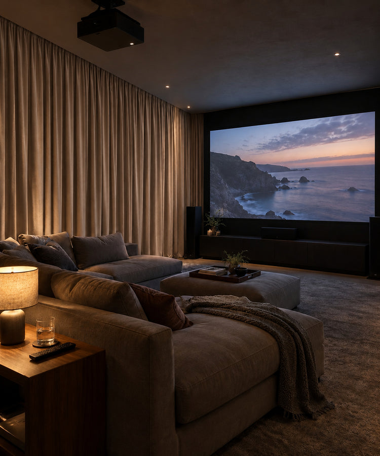
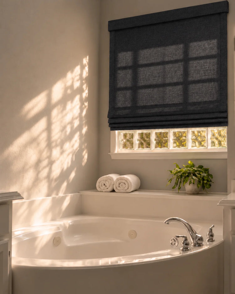
Rich charcoal grays, deep navy blues, and forest greens introduce a strong focal point. Dark fabrics absorb ambient light, establishing an intimate, grounded atmosphere that elevates formal dining spaces and cozy media rooms.
Bedrooms also benefit from dark treatments because deep fibers naturally restrict light penetration, supporting uninterrupted sleep.
| Dark Curtain Metric | Ideal Applications | Potential Drawdowns |
|---|---|---|
| Room Size & Layout | Large primary bedrooms, media rooms, high-ceiling open layouts | Can make small rooms feel cramped or heavy if uncoordinated |
| Aesthetic Context | Rooms with abundant square footage and strong natural light | Direct western sun exposure can fade dark dyes quickly over time |
Installing dark panels in a compact, low-light room creates a heavy, enclosed environment. Without ample square footage or balanced auxiliary lighting, deep fabrics swallow illumination and shrink perceived space.
Additionally, rich pigments absorb thermal energy from direct sunlight, making high-exposure southern windows prone to premature fabric fading.
 For instance, styling a compact living area with warm, textured neutral panels instantly opens up the room. In this inviting space styled by interior creator Sabrina (@sabrinas_living_garden), dark-toned Zoe Brown curtains diffuse the incoming daylight while keeping the sightlines completely open and airy.
4. The 3 Mistakes People Make When Matching Walls to Curtains
Color selection often fails due to common planning missteps. Recognizing these traps prevents costly mistakes before placing an order.
The Exact-Match Wall Trap
Matching curtain color to the exact shade of the wall paint creates a flat, lifeless appearance. Without contrast, the window boundary disappears awkwardly, making the treatment look unfinished. Introduce a slight variance of two or three shades lighter or darker to maintain architectural separation.
Ignoring Flooring and Furniture Undertones
Fabrics do not exist in a vacuum. A grey curtain selected for grey walls will clash instantly if the flooring carries warm yellow oak undertones. Always examine fabric samples against fixed elements like baseboards, flooring, and large upholstery pieces.
Forgetting Bulb Color Temperature
Daytime evaluation differs drastically from evening lighting. Cool 4000K kitchen bulbs shift grey fabrics toward stark blue, while warm 2700K living room lamps turn neutral beige into butter yellow. Test colors under the exact lighting condition the room uses at night.
5. Paralyzed by 3 Similar Swatches? Why Your Screen Is Lying to Your Eyes
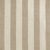
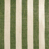
 Even design professionals face this hurdle. Creator Cliff Tan (@dearmodern) often highlights how crucial it is to hold physical swatches up to your actual wall before committing, as digital screens constantly distort subtle undertones.
Digital displays distort color accuracy through pixel brightness and backlight calibration. Two neutral fabric options viewed on a smartphone screen often look identical, yet one features a cool undertone while the other leans warm.
When you narrow your choices down to three close contenders, digital viewing stops working.
Morning light brings out blue and grey undertones, whereas evening lamps cast golden hues. Relying on online images during this final stage leads directly to color regret upon delivery.
6. How to Test Colors Risk-Free Before You Buy
Eliminating uncertainty requires hands-on evaluation. Ordering physical swatches lets you tape actual fabric directly onto the wall next to your window frame. Observe how the material behaves at different hours. Does the fabric maintain its richness when the sun hits it directly? Does it disappear into shadow at night?
Beyond physical swatches, professional assistance removes guesswork. Utilizing a Free Design Service connects you with interior specialists who review your room dimensions and window placement.
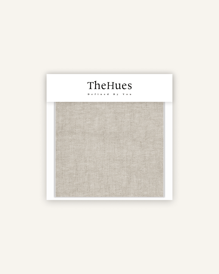
Pairing this consultation with a Free Mockup preview allows you to visualize digital renderings of light and dark options superimposed onto actual photos of your space, guaranteeing confidence before committing to a purchase. You can also explore curated fabric options directly through the TheHues Curtain Swatches Collection.
Frequently Asked Questions
Do dark curtains make a small room look smaller?
Dark curtains absorb light rather than reflecting it. In a compact room with limited windows, this absorption creates heavy visual boundaries that can make the space feel restricted. Balancing dark panels with bright white trim and mirrors prevents this enclosed effect.
Should curtains match the wall color or contrast with it?
Curtains do not need to match walls. Choosing a contrasting tone adds architectural depth and frames the window clearly. Matching walls works best only when aiming for a monochromatic, minimalist aesthetic in spacious rooms.
Do light curtains block enough sunlight for a bedroom?
Standard unlined light curtains allow ambient morning light to filter through. Bedrooms requiring complete darkness for sleep require light-colored panels paired with an opaque blackout lining sewn into the back, such as those found in the Classic Blackout Curtain Series.
Finding Your Balance
Selecting light or dark curtains comes down to evaluating room size, sunlight exposure, and personal lifestyle needs. Taking time to test physical samples and utilize professional layout previews ensures your final choice enhances the room for years to come.